Google Phone App Rolls Out New Gradient Icon Redesign on Android
Google rolls out refreshed gradient icon for Phone app, bringing a modern look to Android devices.
 By Eleanor Garcia
Updated November 16, 2026
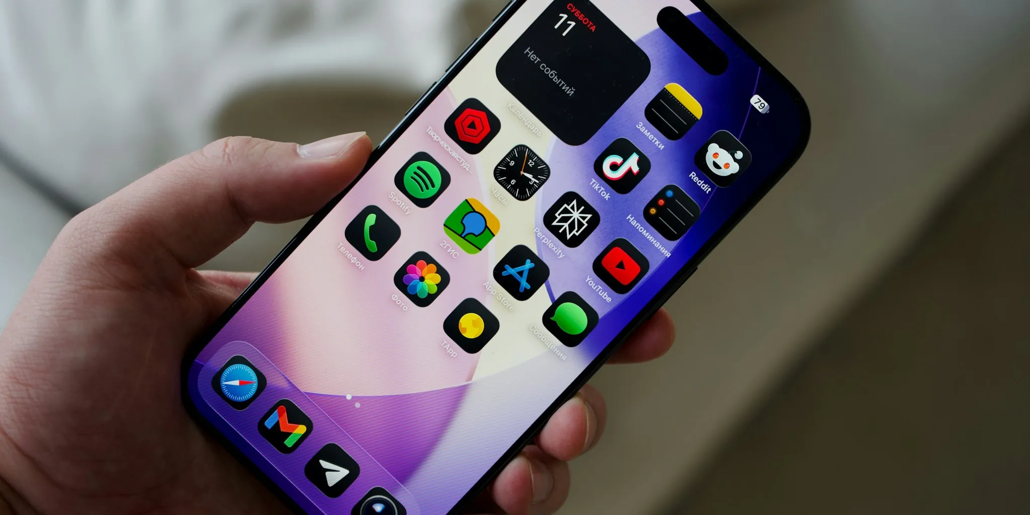
Google has officially rolled out a refreshed icon design for its Phone app, bringing the visual update to the stable version of Android. Version 246 of Phone by Google now features a modern gradient aesthetic that marks a meaningful evolution in how the app appears on your home screen.
What Changed with the New Icon
The updated icon maintains the core phone handset shape you are familiar with, but introduces several refinements that make it feel fresher and more aligned with Google’s current design language. The handset itself is now slightly larger within the icon’s frame, giving it more presence without feeling out of proportion.
The most significant visual change involves the use of gradient effects on the earpiece and mouthpiece areas. This gradient approach creates a flatter, lighter appearance compared to the previous version. Google has also eliminated the darker blue shade that appeared in the old design, opting instead for a color palette that feels more cohesive across the entire Google ecosystem.
According to the company, the refreshed icon is now crisper and clearer, designed specifically to look sharp whether you are viewing it on your phone’s home screen or app drawer. The spacing and overall proportions have been carefully adjusted to ensure the icon remains instantly recognizable while feeling modern.
How This Fits Into Google’s Broader Design Push
This update is part of a larger initiative at Google to modernize its app ecosystem. The Phone app now blends seamlessly with other Google tools like Messages and Contacts, creating a more unified visual experience across your device. When you look at your collection of Google apps together, they now feel like they belong to the same family rather than a collection of disparate tools.
The gradient icon redesign mirrors similar updates Google has already rolled out to its Messages app earlier this week. This consistency helps users instantly recognize Google’s core communication tools and reinforces the company’s commitment to a cohesive design system. Beyond phone management, features like solar chargers and other accessories benefit from clear app interfaces that make managing device settings straightforward.
What This Means for Android Users
If you use Phone by Google, you will begin seeing this updated icon as the stable rollout expands across Android devices. There are no functional changes to the app itself with version 246. The update is purely cosmetic, focused entirely on improving the visual presentation of the app icon.
Google rolled out this design to the beta channel initially in early November, allowing developers and early adopters to provide feedback before the wider release. The fact that the company has now moved the update to the stable channel indicates that the design meets their quality standards and user feedback has been positive.
For users who prefer to stay on the cutting edge, the beta version remains available through the Google Play Store, where you can join the testing program to access upcoming updates before they reach the general population.
The Broader Context of Google’s App Updates
The Phone app redesign represents only part of Google’s ongoing modernization efforts. The company has also been working on updates to Contacts for Android, though that app’s redesigned icon has not yet rolled out to stable users. The Messages app, which received its gradient icon redesign earlier in the week, continues to demonstrate Google’s commitment to refreshing its communication suite.
These visual updates might seem minor on the surface, but they reflect a larger strategy of making Google’s ecosystem feel more integrated and thoughtfully designed. When you spend time managing automatic litter boxes or other smart home devices, having a unified app experience across all your Google tools creates a more pleasant and intuitive interaction.
The gradient design approach specifically serves both aesthetic and practical purposes. Gradients can help reduce eye strain in certain lighting conditions and create a sense of depth that flat designs sometimes lack. By applying gradients thoughtfully to specific elements like the earpiece and mouthpiece, Google has enhanced the icon’s visual appeal without overwhelming the design.
When to Expect the Update
The stable rollout of Phone by Google version 246 with the new gradient icon is happening now on Android devices. If you have not yet received the update, it should arrive within the coming weeks as the rollout expands. You can check your Google Play Store for available updates or manually navigate to the Phone app listing to see if an update is pending.
The updated icon is also live on the web versions of Google’s communication tools at contacts.google.com and messages.google.com, ensuring consistency across both mobile and desktop experiences.
About the author
Eleanor covers smartphones for REMOVU, balancing cameras, battery life, and software support against price. She helps readers find the best value as the field shifts with every release.